How to choose the best 404 error page design for your website
Not all web design is glamorous. As beautiful as a website can be, some elements of any site can seem more workaday by comparison. But that doesn’t mean they are any less important – or require any less thought.
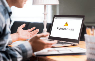
Take the humble 404 error page. This is the website’s fall-back position, it’s a safety net: if any user clicks a broken link, or directly types an incorrect URL, or if for any other reason the page they are seeking does not exist … they will reach the 404 error page. The 404 error page is what tells a user they’ve reached a dead end and need to back up. It’s a crucial element of wayfinding and an important part of any navigational tree.
There’s no way around it: encountering a 404 can be disappointing, even frustrating. This means that a good 404 page softens the blow in some way – keeps a user engaged, rather than letting them click off your site in despair. It will also enable a user to find their way again, and get back to whatever they were doing before the broken link interrupted their user journey.
A good 404 error page requires consideration, then. First and foremost, it should be smart. Ensure your brand is strongly in evidence throughout: make the page particularly attractive, funny or interactive in order to make not find the content you were looking for itself an amusing or diverting experience.
Take the LEGO 404 page: it uses a bold hero image to fantastic effect, and humour to empathise with the user’s frustration. Critically, it provides a link straight back to the shop and the reassurance that everything is still “awesome”. The goal here is to treat the user to a beautiful looking page that raises a smile rather than a frown – and helps get a potential customer straight back into the sales funnel.
The 404 page for the productivity tool Slack is even more impressive: its background scrolls horizontally, offering serious visual interest on a page which could easily simply be a line of text saying “sorry, nothing here”. Putting the extra effort into a 404 page, however, pays dividends: it transforms what might be a frustrating experience into what feels almost like a reward.
Designing a good 404 page, in other words, will increase your conversion rate – because it will help you retain users. The elements to bear in mind in seeking to achieve this included branding, trust-building and fun: your brand will remind your users of why they have chosen your website in the first place; explaining what the 404 is, and providing a route out of it, will build trust and reduce bounce rates; and injecting a bit of fun will ensure that what might have been a poor experience for a user is elevated to at the least an amusing diversion.
Beyond all this, keep things simple and clear: the user should know immediately what has happened, and be given a rapid route back to the rest of the website. Clarity is key because confusion results in click-outs. All of the work you put into a 404 page shouldn’t complicate its central purpose, then – merely enhance the experience.
Simplicity, brand continuity, fun: that’s how to choose the best 404 error page design for your website.
Contact Image Plus for Web Design & Development
If you’d like a website that keeps up with the latest trends and technologies speak to our friendly experts. Our web designers and web developers are based in Coventry, Warwickshire and Manchester and are always ready to help. Please feel free to contact and speak to our team.
Call us on 02476834780, or send us an email at info@image-plus.co.uk.